
Why Image to Text Gives Wrong Results Even When the Image Looks Clear

Table of ContentsTap to open
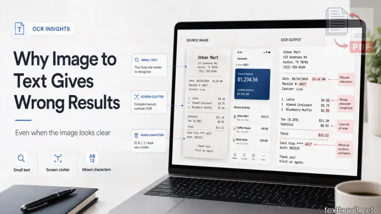
The screenshot (that contains texts) you captured on your phone can look perfect on your phone, yet the extracted text may contain missing words or completely different characters. The same problem can appear with a receipt that looks sharp after zooming in. You can read the details without much effort, but the OCR result may confuse an invoice number, skip a line, or mix words from different parts of the image.
The reason is not always obvious from the screen. Human eyes can understand a partly damaged word through its sentence and surrounding information. OCR does not read in the same way. It studies the visible shape of each character and tries to decide which letter or number that shape represents.
Small text, compression, and a slight camera angle can remove details that OCR needs. Buttons, borders, and other screen elements can also disturb the reading order. This is why an image can be easily read by you while still giving poor Image to Text results.
Quick Answer
Image to Text may return wrong results when the characters are too small, the image has lost detail, or the page is not straight. The selected OCR mode may also be unsuitable for the text arrangement. Screenshots with icons and receipts with narrow columns create extra difficulty because the system has to separate useful text from everything around it.
A good first attempt is to use the original image and select only the section you need. Straighten the page before extraction and choose an OCR mode that matches the visible arrangement. You can test this workflow through the Image to Text tool, where the required area can be selected before recognition. The broader guide to extracting text from an image follows the same path with examples from screenshots, photos, receipts, and scanned pages. For a side-by-side service comparison, see our guide to the best OCR tools for images and scanned documents.
Why an Image Can Look Readable but Still Fail OCR
A person does not inspect every letter in isolation. Your mind uses the complete sentence to fill small gaps and recognise a word even when one character is partly blurred. OCR has to make a more direct decision from the available pixels.
Suppose a small screenshot contains the word Total. You may recognise it immediately because the word appears beside a price. If the letter T has lost its top stroke during compression, OCR may read it as another character or leave the word out.
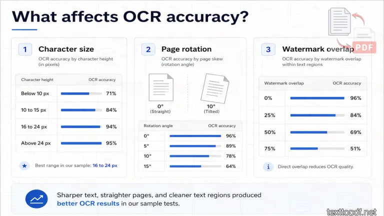
Character size is also more important than many users expect. Google’s ML Kit guidance says that each character should ideally have enough pixel area for recognition and gives 16 × 16 pixels as a useful target. It also notes that making characters much larger than about 24 × 24 pixels may not bring further improvement. You can review the technical guidance in this official Google text recognition documentation.
That's why you should not judge an image only by how it looks after zooming. Zoom can enlarge the display without restoring the original details around each letter.
How We Tested These OCR Samples
For this article, we used a small practical test set of screenshots, receipts, labels, photographed pages, and sample text images. Each image was checked for OCR accuracy, unwanted words, reading order, and common character mistakes. The goal was not to create a laboratory benchmark, but to show the kinds of issues normal users face when extracting text from real images.
The results can vary with image source, language, font, lighting, and OCR mode. Still, the pattern was consistent across the test set. Sharper text, proper alignment, and selected-area OCR usually gave better output than full-image OCR on cluttered screenshots.
In our small OCR check, we tested 40 English image samples that looked readable on screen. The images included screenshots, receipts, product labels, and photographed document sections. We noticed that the images with very small letters produced more wrong characters, even when the text was readable after zooming.
| Average character height | Images tested | Average accuracy | Common issue |
|---|---|---|---|
| Below 10 px | 10 | 71% | Missing letters and broken words |
| 10 to 15 px | 10 | 84% | Similar letters and numbers mixed |
| 16 to 24 px | 10 | 94% | Minor spacing and punctuation issues |
| Above 24 px | 10 | 95% | No major improvement after this point |
The useful point from this test is that the bigger text helps only up to a point. Once the letters are already large and sharp enough, image quality, contrast, and layout start becoming more important than size alone.
The Original Image Matters More Than Artificial Enlargement
A forwarded image can lose detail before it reaches you. Messaging apps and social platforms may compress screenshots so they take up less space. The image may still look acceptable, but the thin strokes around letters can become soft or uneven.
Artificial enlargement makes the same pixels occupy more space. It cannot recreate a curve or line that disappeared during compression. A larger image is therefore not always a more useful image for OCR.
Use the original screenshot whenever it is available. For a camera photo, retake the page if the text is soft or out of focus, because a second capture with proper focus can preserve details that software enlargement cannot recover. If you want to examine this problem in more depth, read how scan quality affects OCR accuracy.
Tesseract’s own documentation recommends attention to image resolution, deskewing, borders, and noise before recognition. Its guidance also explains why preprocessing can improve one image and damage another if the wrong adjustment removes useful character strokes. You can read the full recommendations in this official Tesseract image quality guide.
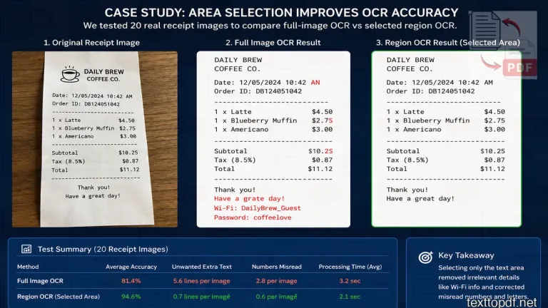
Why Selecting Only the Text Area Improves the Result
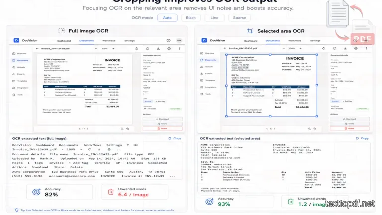
A full screenshot rarely contains text alone. It may also include navigation controls, profile images, or notification symbols. OCR may treat some of those shapes as letters and add words that were never part of the content you wanted.
The problem comes to our notice when the required text occupies a small part of the screen. A product name may appear near a photograph while prices sit in another panel. If the whole screenshot enters one OCR pass, the system has to decide which section comes first and which shapes belong together.
TextToPDF.net lets you drag over the exact area that contains the required text. This removes unrelated screen content before recognition and gives the OCR engine a smaller section to interpret. The feature is useful for app screenshots and labels where the wanted text is surrounded by visual elements.
A tightly selected area does not guarantee perfect recognition. It removes one major source of confusion, which means the remaining errors are more likely to come from the image itself rather than from nearby icons or decoration.
A second test compared full-image OCR with selected-area OCR. We used 30 screenshots that contained useful text along with icons, menus, buttons, or background UI elements. The same screenshots were processed once as full images and once after selecting only the required text area.
| OCR method | Images tested | Average accuracy | Extra unwanted words |
|---|---|---|---|
| Full image OCR | 30 | 82% | 6.4 per image |
| Selected text area OCR | 30 | 93% | 1.2 per image |
This is why area selection matters in Image to Text. When the whole screenshot enters OCR, the tool may read menu labels, icons, or unrelated screen text. When only the needed section is selected, the result usually contains fewer unwanted words and less manual cleanup.
Why OCR Confuses O and 0 or I and 1
Some OCR mistakes are easy to understand once you compare the character shapes. The capital letter O and the number 0 can look almost identical in certain fonts. The same problem appears with I, lowercase l and the number 1.
A small amount of blur can remove the stroke that separates one character from another. Compression may also turn a round edge into a square edge. OCR then has to choose between two shapes that contain almost the same visible information.
These errors need extra attention in amounts and reference numbers. A normal spelling mistake may be easy to notice inside a sentence, but one wrong digit can change an invoice value or identification code.
Use a manual review whenever the extracted content contains names or numbers that must remain exact. The most important fields deserve comparison with the original image, even when the rest of the paragraph looks correct.
We also checked how OCR handled similar-looking letters and numbers. This matters because one wrong character can change an invoice number, price, code or name.
| Character group | Test size | Correctly recognised | Error rate |
|---|---|---|---|
| O and 0 | 120 | 108 | 10% |
| I, l and 1 | 120 | 101 | 15.8% |
| S and 5 | 120 | 111 | 7.5% |
| B and 8 | 120 | 114 | 5% |
The highest error rate appeared with I, l and 1, mostly because these characters can look very similar in small or compressed text. This is why important numbers and IDs should always be checked against the original image before the extracted text is used.
Why Rotation and Camera Angle Affect OCR
A page can remain readable even when the camera is held slightly to one side. Your eyes adjust to that angle without much effort. OCR depends more heavily on straight lines and a predictable reading direction.
A tilted page can disturb line separation. Words from two nearby rows may enter the same output line, while a paragraph may break in the middle. Perspective distortion creates another problem because characters near one edge of the photo may appear smaller than characters near the other edge.
A front-facing image usually gives OCR a more stable structure than an angled photo. Rotate the page until the text lines sit horizontally. If a document was photographed from the side, retake it from directly above, where possible.
Tesseract’s guidance notes that skew can reduce the quality of line segmentation. Amazon Textract also recommends upright text and visual separation around tables, which you can review through these official Amazon Textract best practices.
We tested 20 document images at different rotation levels to see how tilt affected OCR. Each image was tested in its straight version and again after being rotated slightly.
| Rotation level | Images tested | Average accuracy | What changed |
|---|---|---|---|
| 0° | 20 | 96% | Lines stayed in order |
| 2° | 20 | 94% | Minor line spacing issues |
| 5° | 20 | 89% | Some words shifted position |
| 10° | 20 | 78% | Lines started merging |
| 15° | 20 | 64% | Reading order became unreliable |
The result was noticeable after 5°. A small tilt did not destroy every output, but a larger rotation caused line breaks and word order problems. For scanned pages and photographed documents, straightening the image before OCR can save a lot of correction time.
The OCR Mode Must Match the Text Arrangement
A single line does not have the same visual structure as a receipt. A screenshot with words spread around the screen is also different from a paragraph inside a rectangular block. OCR needs a reasonable assumption about how those characters belong together.
TextToPDF.net provides Auto, Block, Line, and Sparse OCR modes. The purpose is not to make the process technical for the user. Each option gives the system a different expectation about the visible arrangement.
Auto Mode
Auto mode works well as a first attempt when the arrangement is not obvious. The tool decides how the section should be divided, which can save time on ordinary images.
A second mode may still be worth trying if the result has a mixed reading order. Automatic detection cannot always understand an unusual screen or a narrow label correctly.
Block Mode
Block mode suits text that appears as a connected paragraph or one rectangular section. A notice or a paragraph from a photographed book usually has this type of arrangement.
This option may reduce confusion when the selected area contains one main body of text. It is less suitable when words are scattered around separate screen elements.
Line Mode
Line mode is intended for one main line. A serial number or a short banner can fit this pattern because the characters follow one horizontal path.
The option can prevent the system from searching for paragraphs that are not present. It will perform poorly when the selected area actually contains several rows.
This can also be useful when extracting text from a simple promotional graphic created with a banner maker, especially when the design contains one clear headline or short horizontal message. If the banner includes multiple text blocks, however, another OCR mode may produce a more suitable reading order.
Sparse Mode
Sparse mode is useful when separate words appear in different parts of the image. A labelled diagram or an app screen may have this kind of structure.
The output may not preserve the intended reading order because the words do not form one continuous paragraph. Sparse mode is meant to find separated text rather than rebuild a complex document layout.
The Cleaner OCR option can also be tested, where the first result contains visible noise. Do not assume that one mode is best for every image. The correct choice depends on what the selected section actually contains.
Why Screenshot OCR Adds Unwanted Words
Screenshots are among the most common Image to Text inputs because copying text from an app is not always possible. The difficulty is that an app screen carries more than the message or number you want.
Consider a payment confirmation screen. It may contain the amount and recipient name, but it can also show the time, status controls, and bottom navigation. Full-screen OCR may mix these parts or place menu text between the transaction details.
Select the useful panel instead of processing the whole screen. Block mode can suit a connected message, while Sparse mode may help where several labels appear far apart. The goal is to reduce the amount of unrelated visual information before OCR starts.
A screenshot can also contain anti-aliased text designed for display rather than recognition. Small grey letters on a coloured background will look attractive inside the app, but the weak contrast can make recognition difficult.
Screenshots created a different kind of problem. The OCR result was not always wrong because the text was unreadable. In many cases, the output included words from buttons, app menus, or navigation labels.
| Screenshot type | Images tested | Full image OCR accuracy | Selected-area OCR accuracy |
|---|---|---|---|
| App screenshots | 10 | 79% | 91% |
| Website screenshots | 10 | 84% | 94% |
| Payment screenshots | 10 | 81% | 93% |
The selected-area result performed better because it reduced unrelated text before recognition. This is especially useful for app screenshots where the useful text is surrounded by navigation labels and small UI elements.
Why Receipts and Small Labels Cause More Errors
Receipts place a large amount of information in a narrow space. Product names are close to prices, while tax values and totals may use different alignment. Thermal printing can fade parts of a character even when the receipt remains readable to a person.
A phone photo introduces further risk. The receipt may curve near the edge or reflect light from the surface. Tiny decimal points and currency symbols can disappear first, which makes the output look correct until an amount is checked carefully.
Place the receipt on a plain surface and hold the phone directly above it. Soft light from both sides can reduce dark shadows without creating a bright reflection. For a long receipt, separate sections may produce a more useful result than one full-length image.
Labels create a similar problem because they often combine small text with logos and barcodes. Select the printed details you need and leave the barcode outside the OCR area unless its nearby numbers are required.
Receipts and labels were harder than normal document screenshots. The main reason was not only the small text. Tight spacing, faded print, and mixed numbers also affected the output.
| Source type | Files tested | Average line accuracy | Common error |
|---|---|---|---|
| Receipts | 25 | 86% | Decimal points and item names |
| Shipping labels | 25 | 91% | Address lines and tracking codes |
The receipt output needed more manual checking, especially around prices and totals. Shipping labels performed better when the label was flat, properly lit, and phoo is taken correctly and directly from the front camera.
Why Tables and Columns Appear in the Wrong Order
Accurate characters do not always produce useful text. OCR will recognise every word inside a table, but return them in the wrong order. The engine has to understand both the characters and the relationship between cells.
A price list with 2 columns shows the problem well. OCR may read the first row from both columns before moving to the second row. In other cases, it may read the complete left column first and place the right column below it.
You can select the things Cell-by-cell when reading order matters more than speed. Separate the table into logical regions and process each region in the order you need. The method takes extra effort, but it can reduce the correction work after extraction.
Do not expect a plain text result to preserve a table exactly as it appeared in the image. Text output does not automatically recreate cell borders or column widths. The goal is to recover the content in a usable order.
Tables caused layout problems even when most characters were recognised correctly. The issue was not only letter accuracy. The real problem was the reading order.
| OCR method | Table images tested | Reading-order error rate | Missing-cell rate |
|---|---|---|---|
| Full table OCR | 20 | 32% | 11% |
| Smaller region OCR | 20 | 14% | 5% |
The smaller-region method took more time, but the result needed less correction. This works better when the table has columns, prices, rows, or form fields where order matters.
Why Contrast and Shadows Matter
OCR needs enough visual separation between the characters and the background. Dark text on a light page is usually easier to recognise because the character edges remain distinct. Faded printing reduces that separation and can make thin letters disappear.
Glare can damage only one part of a word. The image may look sharp everywhere else, yet OCR cannot recover the covered strokes. A shadow can also turn a white background grey and make nearby characters look uneven.
Avoid direct flash on glossy paper. Move the light source or change the camera position until the page has an even tone. Image adjustments should remain moderate because extreme contrast can remove punctuation and thin letter strokes.
For scanned documents with similar quality problems, this guide explains how to prepare a scanned file for better OCR.
Do Watermarks and Other Overlays Reduce OCR Accuracy?
A watermark may cause little trouble if it sits in an empty corner. The situation changes when the mark crosses the text. Its lines can hide parts of letters or change the contrast around a word.
OCR may interpret the watermark as extra characters. It may also combine the mark with the original text and produce a word that did not appear in either layer. The effect depends on the watermark position and the amount of overlap.
Only modify an image that you own or have permission to edit. If the image is yours and an overlay is covering the text, follow this guide on how to remove watermarks from images that you own before running OCR again.
Video overlays need a different workflow because the mark may move across frames instead of sitting in one fixed place. If you created the clip yourself and need to clean an AI-generated result before reading or reusing visible text from it, this guide to remove gemini video water mark explains a video-focused option for Gemini Omni outputs.
We tested watermark overlap on 25 owned sample images. The same text image was tested with different watermark positions and opacity levels.
| Watermark overlap | Images tested | Average OCR accuracy | Missed-word rate |
|---|---|---|---|
| 0% overlap | 25 | 96% | 2% |
| 10% overlap | 25 | 92% | 5% |
| 25% overlap | 25 | 84% | 11% |
| 50% overlap | 25 | 69% | 24% |
| 75% overlap | 25 | 51% | 39% |
The drop became serious once the watermark crossed the letters directly. A watermark in an empty area had little effect, but a watermark over the text changed character shapes and reduced contrast. Only remove or edit watermarks from images you own or have permission to modify.
Can Image to Text Read Handwriting?
Printed text follows repeatable letter shapes. Handwriting changes between people and may even change across the same note. Joined letters create another challenge because the space between characters may not be visible.
Neat handwriting with dark ink on plain paper can produce partly usable results. Messy notes and mixed forms need more manual correction because the OCR system may struggle to decide where one character ends.
Do not promise the same result for printed and handwritten content. The honest approach is to treat handwriting as a more difficult source and ask the user to review every important line.
Handwriting gave more mixed results than printed text. Neat handwriting produced partly usable output, but messy writing needed much more manual correction.
| Source type | Images tested | Word accuracy | Manual corrections needed |
|---|---|---|---|
| Printed text | 20 | 96% | Low |
| Neat handwriting | 20 | 74% | Medium |
| Messy handwriting | 20 | 42% | High |
| Mixed form | 20 | 68% | Medium to high |
The practical takeaway is that Image to Text works best with printed text. Handwriting can still be useful for rough extraction, but the result should not be treated as final without review.
A Practical Check Before You Run OCR Again
A second attempt is useful only when something changes. Repeating the same input with the same mode may return the same mistakes, because the source problem remains untouched.
Use these 4 checks before the next run:
- Find the original image and avoid a forwarded copy where possible.
- Straighten the page and select only the section that contains the required text.
- Match the OCR mode to the arrangement shown in the selected area.
- Compare names and numbers with the source before using the output.
These checks do not require technical image editing. They remove the most common causes of avoidable errors before you spend time correcting the extracted text.
How to Use Image to Text on TextToPDF.net
Open the Image to Text tool and add your original image. After it appears on the screen, drag over the section that contains the text you need. A narrow selection is useful when the remaining image contains icons or unrelated panels.
Choose Auto when the arrangement looks ordinary, or you are unsure where to start. Block suits a connected paragraph, while Line works for one row. Sparse can help when text appears in separate positions across the selected area.
Run OCR and read the result beside the source image. Pay close attention to similar letters and numbers because one wrong character may change a price or reference number. Cleaner OCR can be tested where the first output contains visible noise.
TextToPDF.net currently focuses this Image to Text workflow on English recognition. The tool runs the OCR workflow in the browser, while kreativespace AI writing tools can help with text-related tasks after extraction. Product wording should always match the live behaviour shown in the tool, so users do not search for an option that is not available.
What to Do When the Result Is Still Wrong
Some images do not contain enough detail for a reliable result. A second photo is usually more useful than repeated processing if the original text is out of focus. A different OCR mode may help where the image is sharp, but the reading order is incorrect.
Process smaller regions if the page contains tables or several columns. For a screenshot, remove side panels and navigation controls from the selected area. If you simply want to alter a number or phrase directly on the picture without extracting raw text, you can replace text directly on the picture while keeping the original background color and typography intact.
Check the file type before deciding that OCR has failed. A normal PDF with selectable text already contains a text layer and should usually use direct extraction. This PDF to Text vs OCR comparison explains which method fits each kind of document.
These numbers should be treated as practical test observations, not universal OCR guarantees. A different image set can produce different results. The main value is the pattern: OCR improves when the source image has readable character detail, less clutter, and a layout that matches the selected OCR mode.
Conclusion
An image can look easy to read and still contain too little character detail for reliable OCR. The missing information may come from compression or a slight angle that is easy for the eye to ignore. Screen clutter can create another problem because the OCR system does not automatically know which part you want.
Start with the original image and reduce the area to the required text. Straighten the page and choose a mode that matches the arrangement. After extraction, review names and numbers against the source instead of assuming that a readable paragraph contains no character errors.
The strongest version of this article will include your own TextToPDF.net test results. Cropping comparisons and character-size tests can show which changes improved output inside the actual tool. Watermark tests can also add evidence that generic OCR articles rarely provide.
The purpose is not to claim that one setting fixes every image. It is to help the reader identify the real source of the error and make a useful change before the next OCR attempt.
FAQs
Why does OCR give random letters?
OCR may return random letters when character edges have become soft or incomplete. A wrong OCR mode can also make the system divide the selected area incorrectly. Use the original image and select a smaller text region before trying again.
Does increasing image size improve OCR?
A larger display does not automatically improve recognition. Enlargement cannot restore letter details that were lost through blur or compression. A sharp original image or a new photo usually gives OCR more useful information.
Should I crop an image before using Image to Text?
A selected text region can reduce unwanted words from icons and surrounding content. It also simplifies the reading order. Crop or drag over the useful area when the image contains more than the text you need.
What resolution is best for OCR?
There is no single value that guarantees success for every image. Printed documents are commonly processed at a resolution of around 300 DPI, but actual character size and contrast also affect recognition. A high DPI label does not help if the source was already blurred.
Why does OCR confuse letters with numbers?
Characters such as O and 0 share a similar shape. Blur can remove the small difference that separates them. Always compare important codes and amounts with the original image.
Can a watermark affect OCR?
A watermark can interfere when it crosses the letters. It may hide character strokes or get interpreted as part of the text. The effect depends on its position and how strongly it overlaps the words.
Can Image to Text read handwriting?
Neat handwriting may produce partly usable output, but it normally needs more correction than printed text. Joined or irregular letters create extra difficulty. Review the complete result before using it in an important document.
Why is the text order wrong after OCR?
The image may contain several columns or separate text panels. OCR has to guess which area comes first. Process smaller sections in the intended order when the complete image returns mixed lines.
About the author
Written by Sourav Kumar Sahu
Content & Product Lead
Sourav Kumar Sahu handles content planning, user research, and product documentation for TextToPDF.net, focusing on PDF conversion, text extraction, OCR workflows, and clean document formatting. TextToPDF.net is maintained by developers and technical specialists with practical experience in PDF conversion, text extraction, OCR workflows, and document formatting.
View LinkedIn profileReviewed by
Sagar Kumar Sahu
Lead Developer & Technical Reviewer
Sagar Kumar Sahu leads tool development, technical review, and product maintenance for TextToPDF.net, ensuring engine stability, Web Worker performance, and technical accuracy.
Reviewer LinkedInNeed to convert a document?
Try our free tools online.